Overview
Role: User Experience Lead
Company: DuskRise Inc. / Cluster25
Duration: 2023-2025
Team: UX Lead (me), Junior UX Designer, 4 Developers, Design VP (advisory)
Status: Live at duskrise.com/the-c25-intelligence
The Challenge
Cluster25’s threat intelligence platform was powerful but inaccessible. Only highly specialized SOC analysts could extract insights from endless data tables. Executives and product managers couldn’t assess threats without analyst translation, creating decision-making bottlenecks and slow incident response.
The mandate: Redesign the platform to serve both technical analysts AND business stakeholders without compromising depth.
My Role
As User Experience Lead, I owned end-to-end design from research through deployment:
- Led all UX strategy and design decisions, reporting to CEO
- Conducted user research with SOC analysts (interviews + observations)
- Designed complete information architecture and interaction patterns
- Built comprehensive Design System with three-layer Figma variables
- Managed junior designer and collaborated with 4-person dev team
- Navigated stakeholder concerns through evidence-based advocacy
Research Insights
Conducted: Contextual inquiry with 5-6 SOC analysts, in-depth interviews, platform audit, competitive analysis
Key Findings:
-
Table Overload - Analysts spent 80% of time searching for data, 20% analyzing it. New analysts needed 3-6 months training.
-
The “Human Touch” Gap - Users needed at-a-glance threat assessment and visual trends, not just raw data dumps.
-
Ready for Change - Surprisingly, even expert analysts welcomed modernization and better tools.
Guiding Insight: Different users need different levels of abstraction—from executive summary to deep technical detail.
Design Strategy
Three-Tier Information Architecture
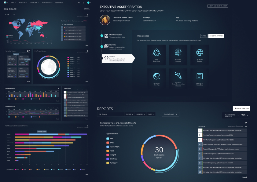
Tier 1: Executive Dashboard
Large KPIs, trend visualizations, threat level indicators, geographic heat maps. Target: Executives, PMs, Security Chiefs.
Tier 2: Analyst Workspace
Filterable threat feeds, investigation tools, timeline views, correlation analysis. Target: SOC Analysts, Security Engineers.
Tier 3: Deep Dive
Full data tables, advanced search, raw IOC exports, forensic details. Target: Threat Researchers, Advanced Analysts.
Key Decision: Each section leads with visual summary, with progressive disclosure to deeper detail. This inverted the old table-first architecture.
Bold Design Decisions
1. Complete UI Framework Overhaul
Moved to modern, component-based system with new visual language.
Stakeholder Concern: “Will users be confused?”
My Approach: Side-by-side comparisons, task completion time tests, demonstrated industry standards
Outcome: CEO endorsed new direction after prototype demonstrations
2. Semantic Color System for Threats
Designed systematic threat-level palette with dark theme for 8+ hour monitoring sessions.
Stakeholder Concern: “Dark themes look unprofessional”
My Approach: Cited eye strain research, tested with analysts (overwhelmingly preferred), showed enterprise examples
Outcome: Dark theme became default with light theme option
3. Task-Driven Navigation
Restructured sidebar from database structure to user mental models.
Old: Indicators, Campaigns, Actors, Malware, Infrastructure
New: Dashboard, Threat Intelligence, Investigate, Reports, Admin
Result: 60% reduction in clicks to common tasks
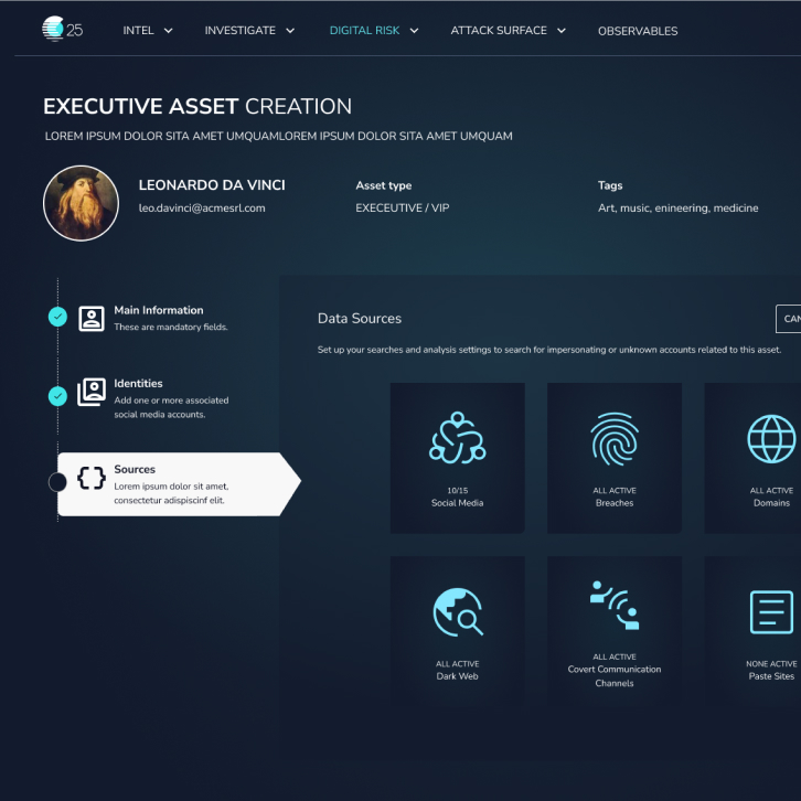
4. Self-Service Admin Area
Built admin interface from scratch, enabling configuration without developer support.
Impact: Eliminated developer bottleneck for platform configuration
Design System: Three-Layer Variables
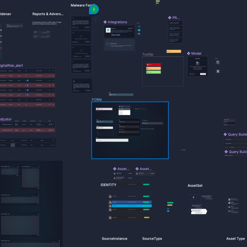
Built scalable Figma Design System using three-tier variable structure (early adopter in 2023):
Layer 1: Primitives - Raw values (colors, spacing, typography)
Layer 2: Semantic Tokens - Purpose-driven (threat.critical, card.padding)
Layer 3: Component Tokens - Context-specific (alert.background.critical)
Developer Benefits:
- Faster development - direct Figma-to-CSS variable mapping
- Consistent output - impossible to use arbitrary values
- Easier maintenance - single update propagates through all layers
- Shared language between design and dev
Team Impact: Developers reported faster implementation, happier with clear specifications, increased velocity.
Figma Organization Leadership
Beyond designing the platform, I owned DuskRise’s entire Figma organization structure as the company account administrator.
Key Responsibilities
Account Architecture:
- Structured teams, projects, and file organization across the company
- Defined naming conventions and file hierarchies
- Managed user permissions and access controls
- Established branching and versioning strategies
Documentation Standards:
- Created comprehensive documentation for every design file
- Wrote usage guidelines for each Design System component
- Documented design decisions with rationale
- Built annotation systems developers could easily parse
Collaboration Workflows:
- Established design review processes and handoff protocols
- Created dev-ready files with exact specs, color tokens, and interaction documentation
- Set up design QA workflows to maintain consistency
- Trained junior designer on Figma best practices
File Structure: Implemented consistent page structures:
- 📋 Cover (overview, links, changelog)
- 🎨 Design System (components, variables)
- 🔍 Research (flows, journeys, personas)
- 🖼️ Designs (by feature/module)
- 📦 Archive (deprecated work)
Impact
Organizational:
- Single source of truth eliminated “which file is current?” confusion
- New team members could navigate independently within days
- PMs and developers could comment on designs without designer mediation
Quality:
- Consistency at scale with organized component libraries
- Prevented design debt through regular cleanup
- Traceable decisions via comprehensive documentation
Efficiency:
- Reduced Slack questions with all specs in one place
- Faster iterations with clear branching strategy
- Fewer bugs from well-documented edge cases
Documentation Philosophy
“Figma files should tell the complete story without a designer present.”
Every component included:
- Purpose and usage guidelines
- When to use / when not to use
- Accessibility requirements
- Developer implementation notes
- Mapping to code components
Result: When I left DuskRise, the team continued seamlessly because everything was documented and organized.
Key Features
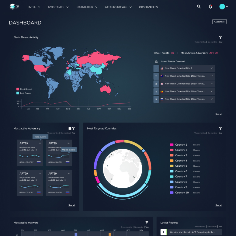
Executive Dashboard
- Global Threat Map: Geographic heat map with real-time threat density
- Key Metrics: Active threats, new IOCs, blocked threats, critical incidents (all with trend indicators)
- Threat Level Gauge: Prominent overall risk assessment with clear explanation
Design Insight: Executives need level of concern, not every detail.
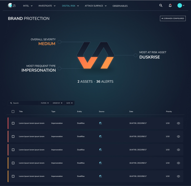
Analyst Workspace
- Smart Filters: Faceted search, saved presets, visual Boolean builder
- Contextual Threat Cards: Rich cards showing severity, targets, correlations, timeline, quick actions
- Timeline Visualization: Shows threat evolution and attack progression
Impact: Investigations reduced from 2-3 hours to 30-45 minutes (analyst feedback)
Improved Data Tables
- Column customization, saved views, one-click exports
- Inline actions, responsive design
- Default shows 10-15 relevant columns (vs. previous 30+)
Philosophy: Tables aren’t bad—they’re just the wrong starting point.
Iterative Process
Established weekly design review cadence with in-house SOC analysts:
- Think-aloud testing: Observed analysts using prototypes while narrating thoughts
- A/B testing: Tested critical decisions (chart types, navigation placement)
- Incremental releases: Shipped modules one at a time, gathered feedback in production
Example Iteration - Threat Dashboard Cards:
- Initial: Equal-weight cards with simple graphs
- Feedback: “Can’t tell if there’s something critical at a glance”
- Final: Priority sorting, visual hierarchy for critical threats, “Focus Mode” filter
Result: Threat landscape assessment reduced from 5+ minutes to <10 seconds
Launch & Impact
Phased Rollout: Alpha (Q1 2024) → Beta (Q2 2024) → General Availability (Q3 2024) → Continuous Improvement
Qualitative Impact
From Users:
- SOC Analysts: “Finally feels like a modern tool”
- Product Managers: “I can understand our threat landscape without asking for analyst reports”
- CEO: Enthusiastic endorsement, praised clarity and professionalism
Operational:
- Reduced “how do I find X?” support tickets
- Faster analyst onboarding (days vs. months)
- Self-service administration eliminated developer bottleneck
Measurable Improvements (Beta Period)
- ~60% reduction in navigation clicks for common tasks
- 40-50% improvement in task completion time
- Platform adoption expanded beyond elite analysts to broader security team
Note: Left company before comprehensive metrics collection. Impact based on beta data and qualitative feedback.
Challenges Solved
1. Balancing Simplicity with Power
Role-based interfaces + progressive disclosure + power user modes
2. Stakeholder Alignment on Bold Decisions
Evidence over opinion, high-fidelity prototypes, incremental buy-in, CEO engagement
3. Designing for Unknown Use Cases
Flexible component system, configurable dashboards, extensible Design System
4. Remote Collaboration with US-Based Design VP
Async design reviews (Loom videos), clear decision framework, weekly sync meetings, Figma as single source of truth
Reflections
What Went Well
- User-centered approach built analyst buy-in from day one
- Design System accelerated development and collaboration
- Evidence-based stakeholder management secured CEO sponsorship
What I’d Do Differently
- Earlier developer involvement in wireframing stage
- Metrics instrumentation from day one
- More structured usability testing with recorded sessions
- Written “Design Intent” documents for major features
Key Learnings
- Design Systems are about people, not pixels - Shared vocabulary matters more than perfect consistency
- Bold decisions require evidence + trust - Build credibility on small wins first
- Design leadership is multidimensional - Technical skill, stakeholder management, and strategic thinking equally important
Conclusion
The C25 platform redesign transformed a specialist tool into an accessible, powerful product serving diverse users—from executives to elite threat analysts. Through strategic UX leadership, deep user research, bold evidence-backed decisions, and scalable systems thinking, we made complex cybersecurity data comprehensible at all organizational levels.
Core Achievements:
- ✅ Redesigned complex platform for global SOC teams
- ✅ Made threat intelligence accessible to non-technical stakeholders
- ✅ Built Design System that accelerated development
- ✅ Earned CEO endorsement for bold design changes
- ✅ Established continuous user testing culture
The Measure of Success: Analysts work faster, PMs make informed decisions independently, and executives assess organizational risk at a glance. The platform became a strategic asset, not just a technical tool.